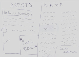
My front cover will hopefully look like the scamp above. I plan on using a fuzzy font to reflect the rock sort of genre. A plug is added to attract my audience and the image of the artist will be the most prominant feature. I feel as if this scamp looks effective and if I stick to it then ill have a good outcome.
This is my contents page, it follows the conventions of a real contents page so I hope to stick with this style.
My double page spread is what I found most challenging to design due to the vast amount of space I had to work with. Eventually i ended up sticking with a simplistic idea.
Where Music Meets Passion...
Friday, 9 March 2012
Monday, 5 March 2012
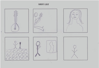
Shot List
Above is a scan of my shot list. I chose to have the guitar shot as I plan to edit the image and place the text for my double page spread in the guitar. the second image I chose to plan was on with my model siting against a wall with a guitar in her hand, I did this because I wanted her to look as if she was leaning on the page which could be an effect image. Another image which I find eye catching is the model looking in to a mirror with her reflection thats different looking back at her, this will emphasise her change of character.
Subscribe to:
Posts (Atom)


